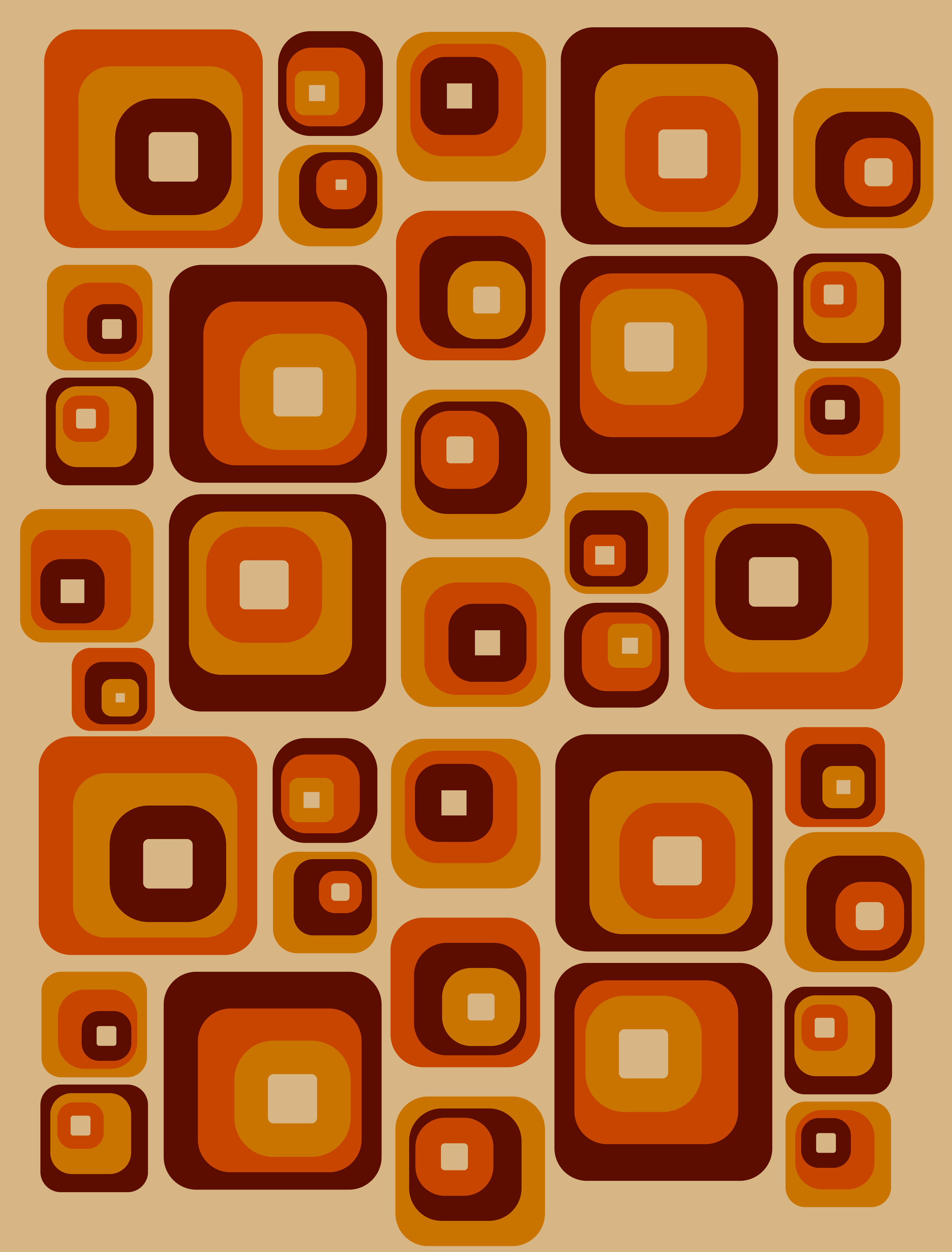
GRAPHIC DESIGN WORK:
My graphic design work, designed on Adobe Illustrator and Photoshop.

Pride themed T-shirt design done in Adobe Photoshop and Illustrator


Cover for Fictional Netflix show designed on Adobe Photoshop
Final design:
Graphic t-shirt design for musician Chloë Wilson

Tarot cards imitating the ones shown in the TV show “The Traitors” made on Adobe Illustrator

Business card designed on Adobe Photoshop

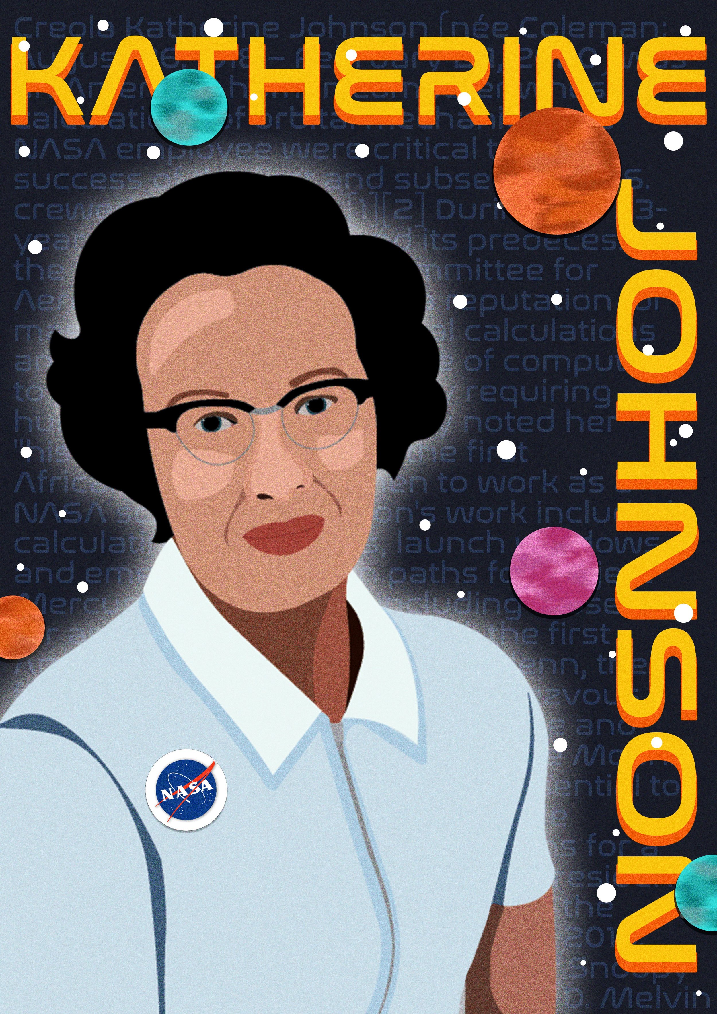
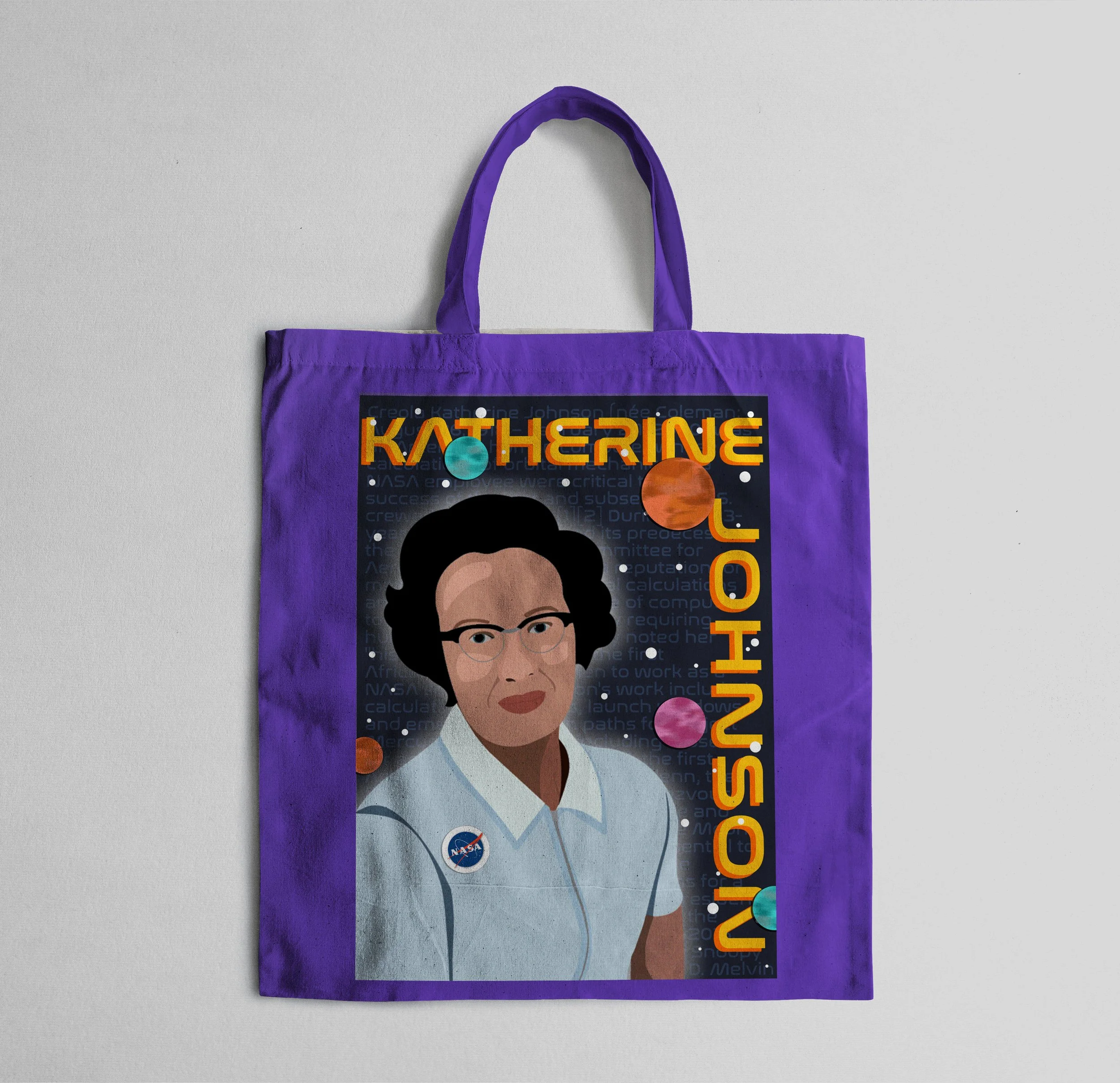
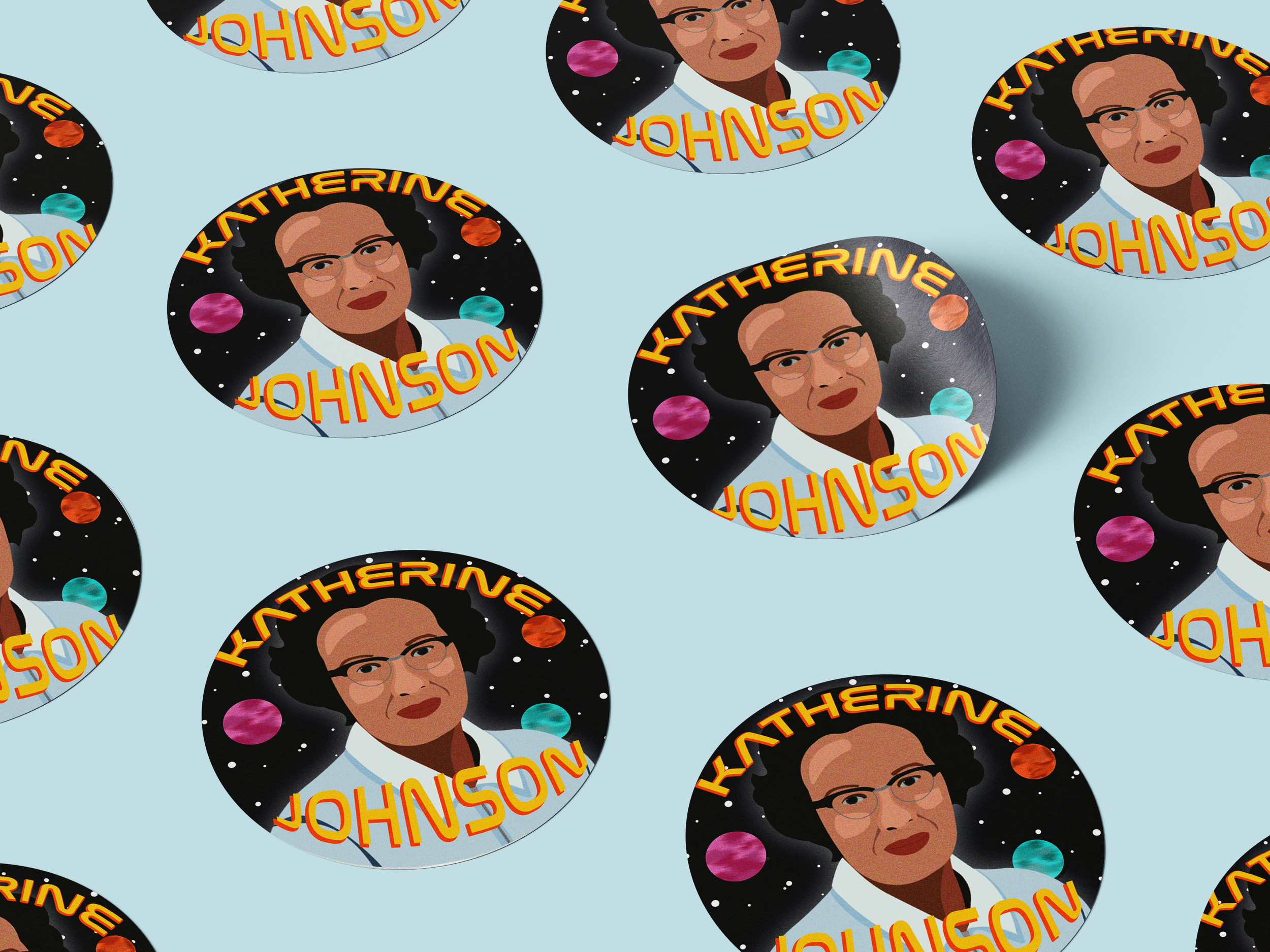
Political portrait of Katherine Johnson: The brief was to create a political portrait of an important figure. I decided on Katherine Johnson since I've seen the film Hidden figures and was inspired by her story of battling discrimination and helping NASA with the race to space. For my research I decided to rewatch the film and I also read this article about how accurate it was to the real story. I first did a mood board of the style I wanted to go for which was quite retro and kitschy and then I did some experimentation by importing a picture of Katherine into Photoshop and trying out different layouts and colours with it, and then I started on the actual portrait by importing the same photo into Adobe Illustrator and using the curvature tool to replicate the shapes and once I was done I imported it into Adobe Photoshop and made the background with text from her Wikipedia page and added planets, giving them texture with the brush tool and the effects “ripple” and “motion blur”. I then added text of her name and gave it an orange drop-shadow to emulate the Kitsch style. I also made a tote bag and a sticker mock-up from templates online.
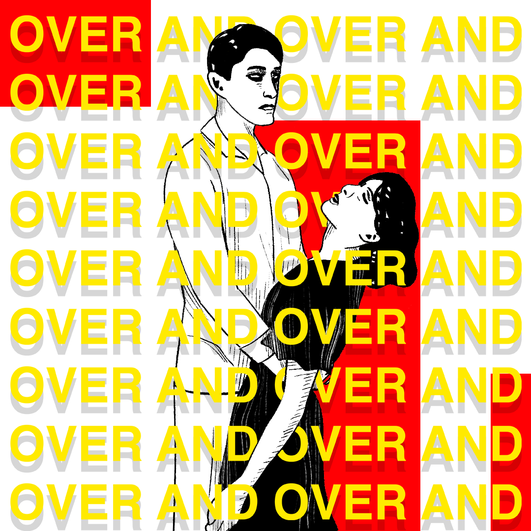
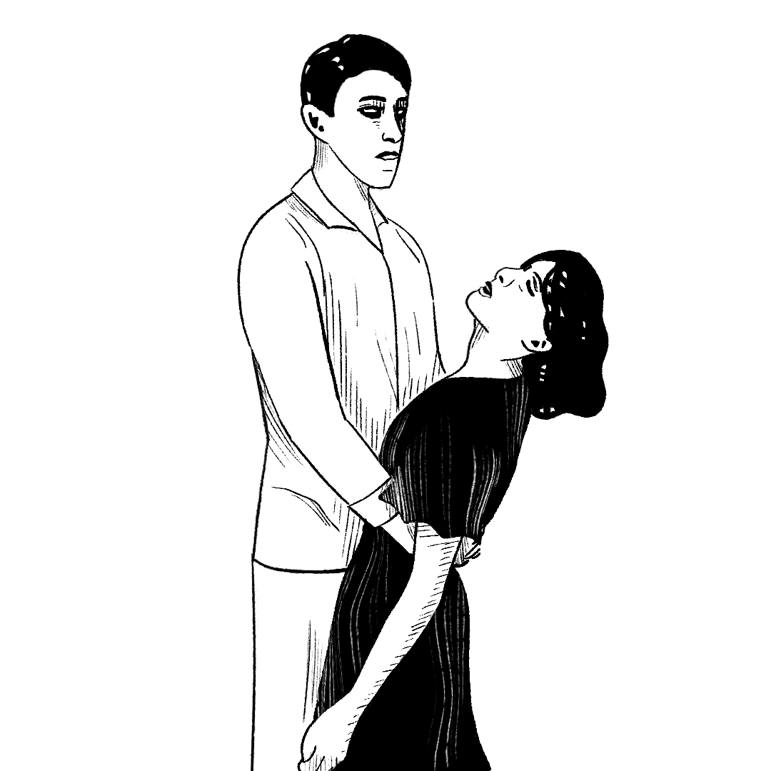
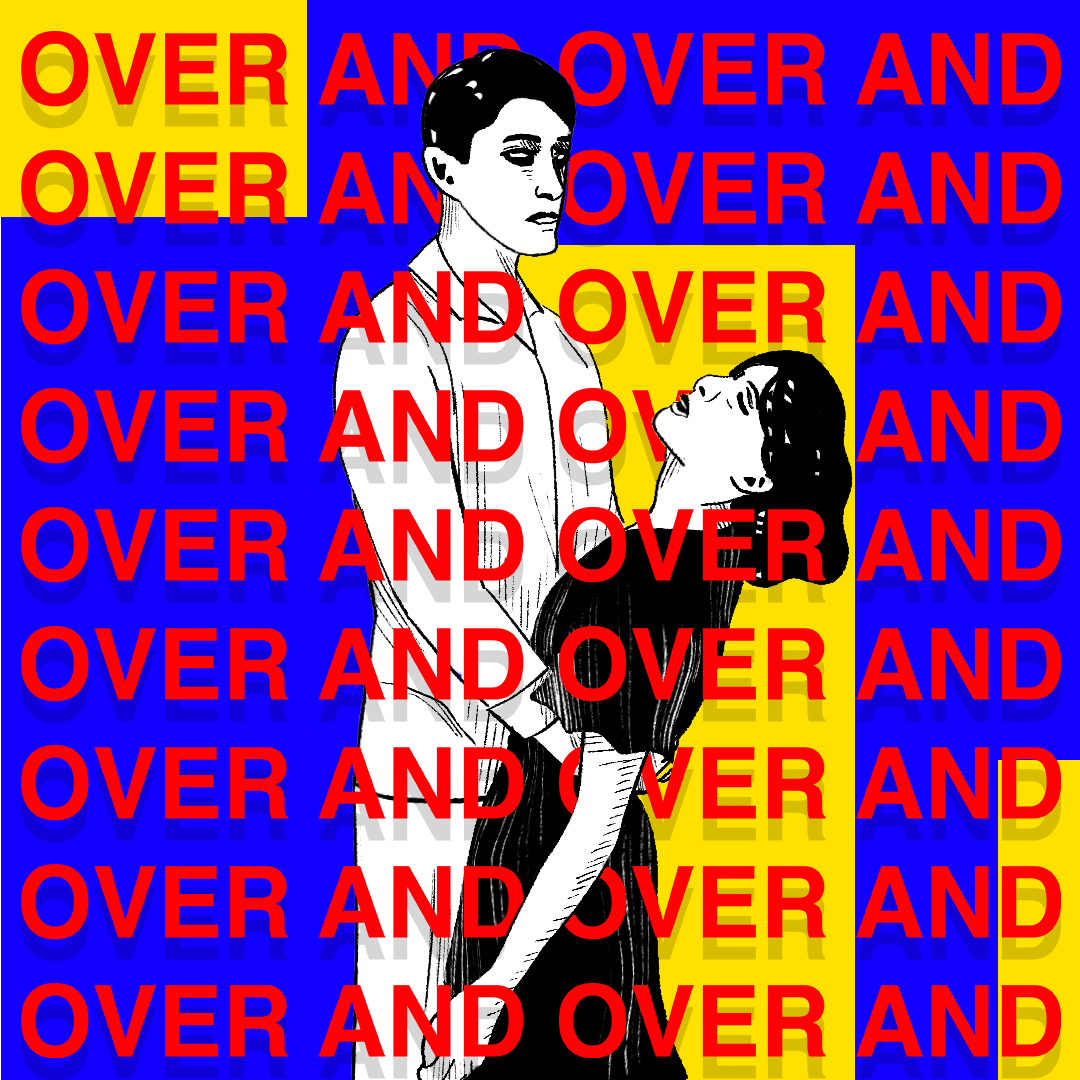
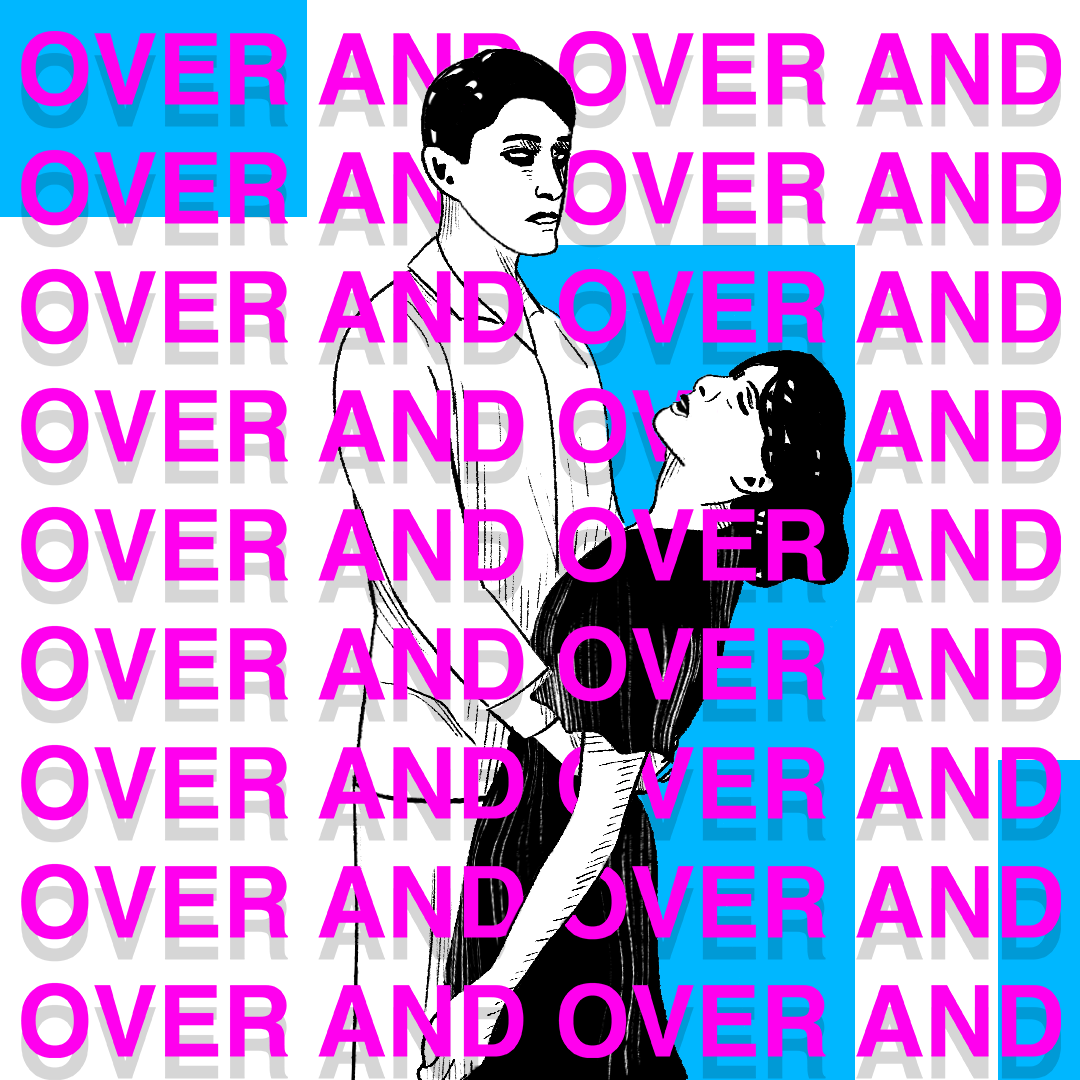
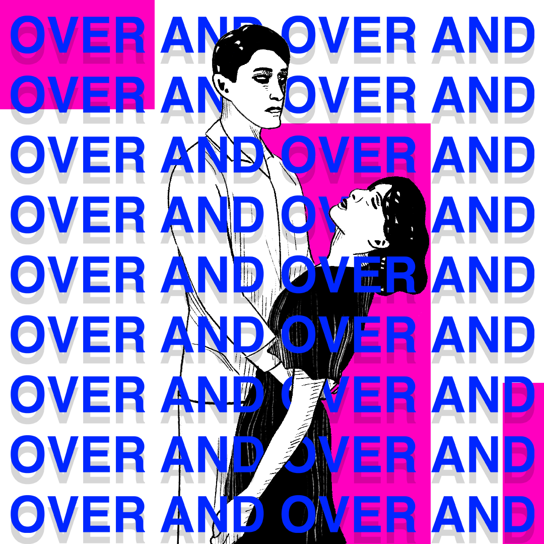
I was tasked to create a design for a play called “Over and over and over” who were inspired by dance marathons in the 1930’s and wanted me to create something inspired by this with a woman fainting in a man’s arms. To stay true to the era I researched 1930’s artwork/sketches and replicated this in my final design. They also wanted the phrase “Over and over” repeated across the design so I did this as well, adding a drop shadow to make the text stand out a bit more and to emphasise the repeating effect. In terms of the colours, they wanted something bright and vibrant so I gave them a few options for them to choose from and they decided on this final one.
